Concept
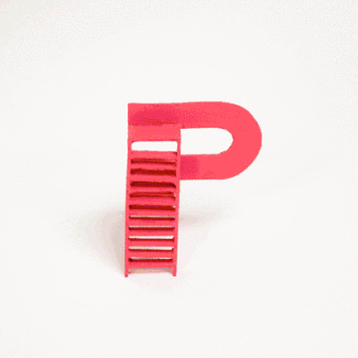
The letterforms depict different types of paths, including direct routes, detours, obstacles, and moments of pause, mirroring the nonlinear nature of problem-solving and personal growth. Rather than treating letters as static symbols, the alphabet reframes typography as an experiential system that can be navigated, touched, and understood through movement. At a small scale, the forms act as tactile objects that help children engage with shape and structure through play. At a larger scale, the same forms suggest environments for climbing, resting, and exploration, positioning perseverance as something learned through experience rather than instruction.
Skills
Conceptual typography, physical prototyping, spatial design, model-making, material exploration, experiential thinking.